Map Talk
ONA St. Louis @ TechArtista
2017-05-11
—
Brent Jones, Data Visual Specialist
St. Louis Public Radio
@brentajones, bjones.net
Maps are important. When we're quoting someone in a story, we often provide the person's age, hometown, occupation or some other details to help contextualize why they're important to the story, why the reader should trust them. Maps provide that function for the story as a whole — they put the place in context, and help orient the reader spatially.
If a story is happening a couple blocks away from Forest Park, or in sight of the river, or across the highway from Lambert, that might help add to my understanding.
So how can we do that?
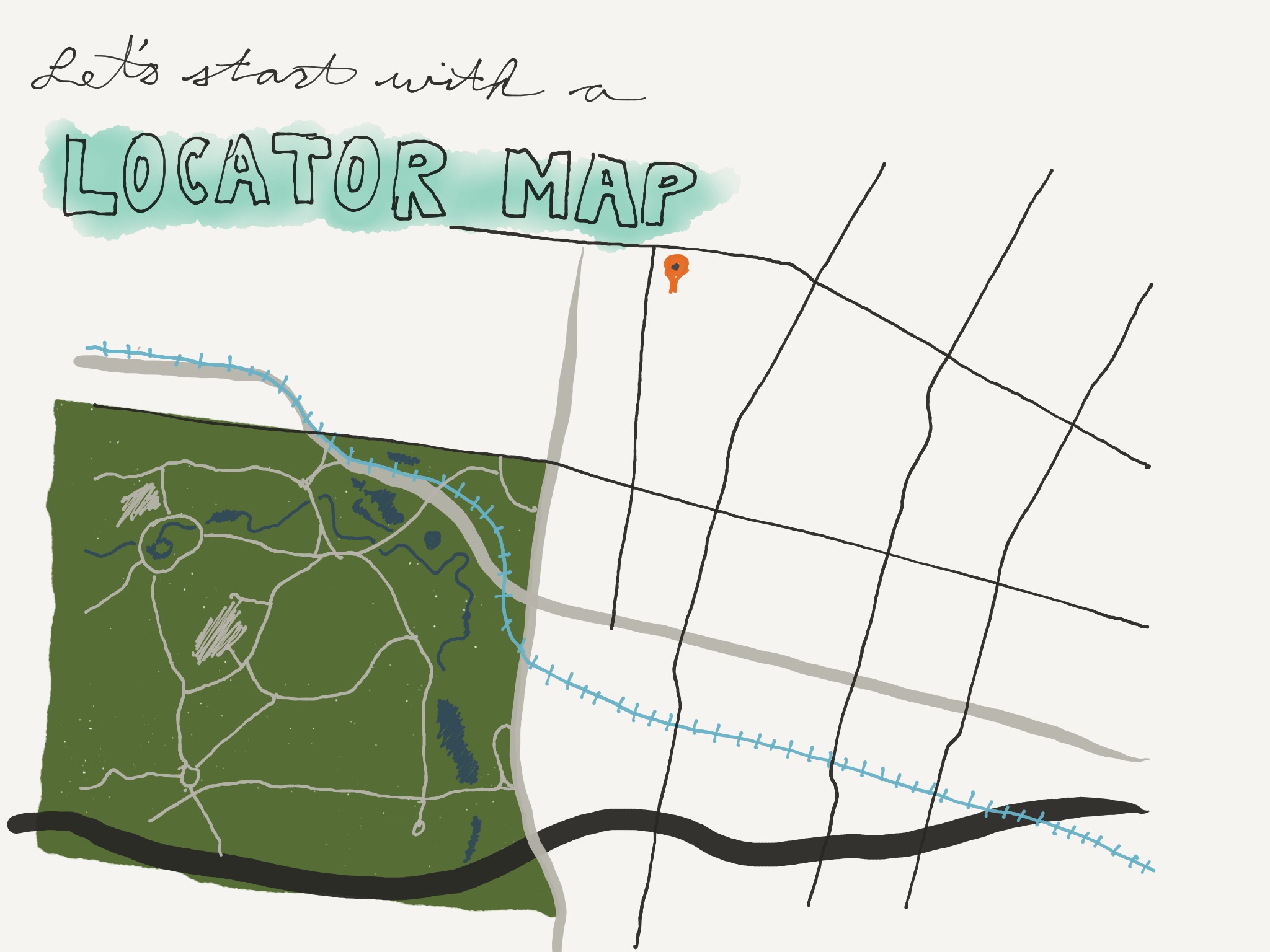
Let's start with a locator map. These are simple, usually small maps that show a few features. Their purpose is to help get a reader oriented to where your story is happening. Thus, they're usually not interactive — often they're just a static image.
One place you can do this is Staticmapmaker.com
They provide lots of services. Some require API keys. Google does not, unless you get lots of hits.
You shouldn't just create a map and take a screenshot.
So those are locator maps. Simple to use, and if your CMS can handle images, you can probably start using them right away. But of course there are more advanced kinds of maps as well. On our way there, though, I'm going to have to explain some basic mapping concepts.
I should pause at this point to say that I'm not a mapping expert. But this is just stuff that I've learned over the course of working with maps. I'd encourage you to find more sources and learn more about it on your own. There's a lot out there.
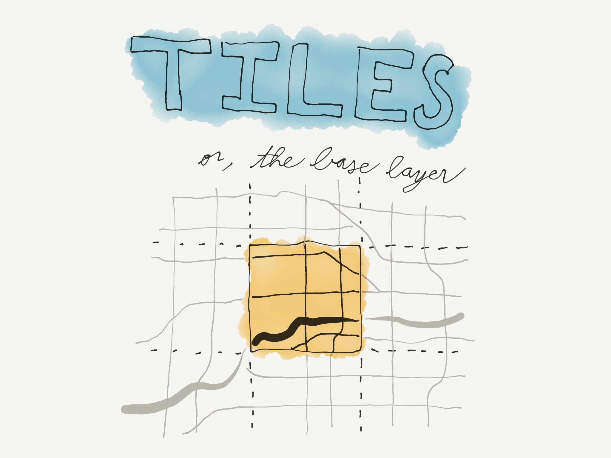
Map tiles are the background of your map. They're called tiles, because they're split up into small, square pieces so that your browser only needs to load what you can see in the window. Tiles are a big part of determining the overall style of your map.
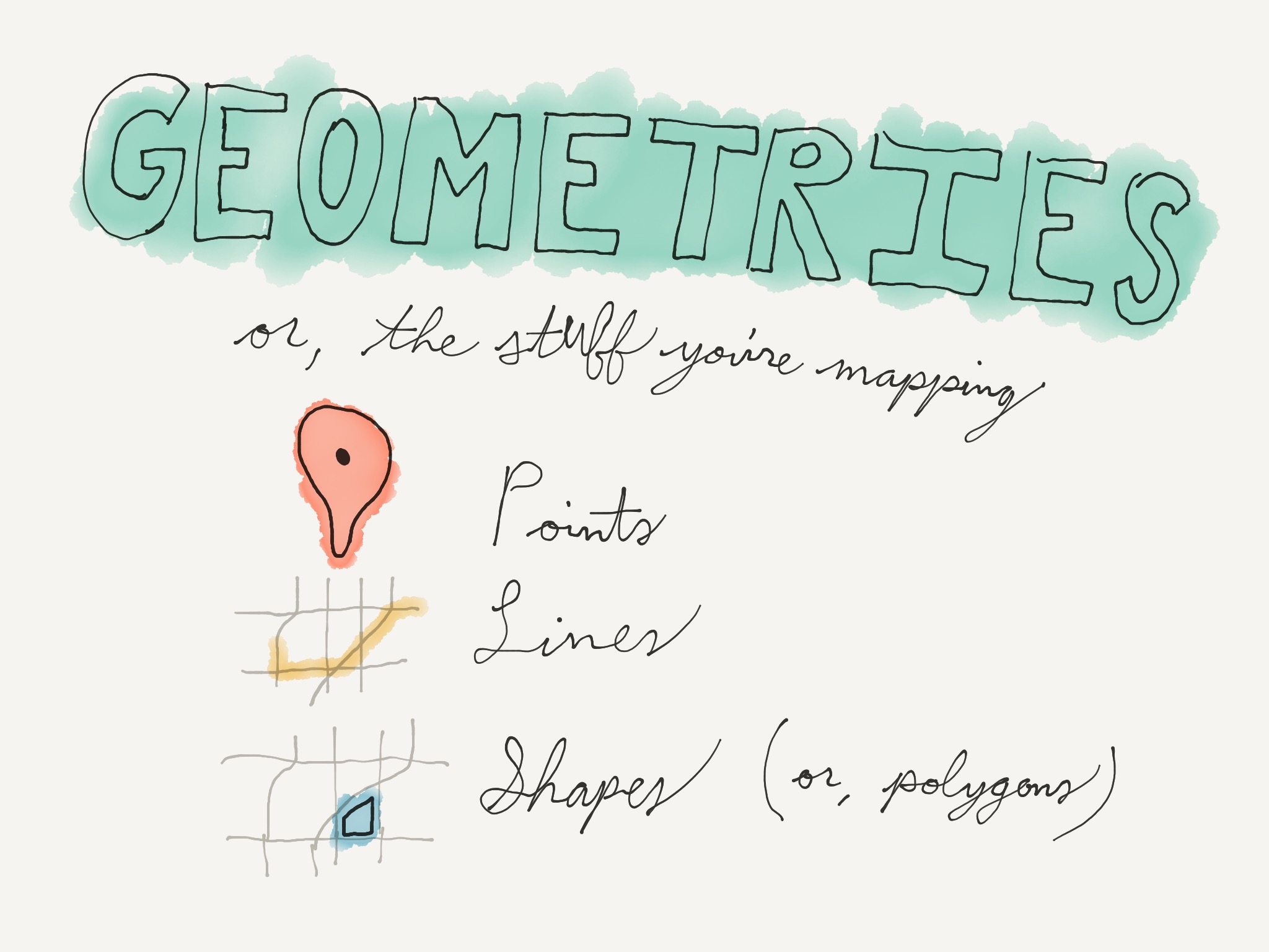
Up next are geometries. If tiles are the backgrounds of your map, geometries are the star of the show. They're what you're actually trying to show on the map. There are three kinds: Points, lines and shapes.
We just used points in the locator map. These can be anything that's reduced to a single marker. All you need for a point is a location.
Lines are two or more connected points, but not a closed shape. These can be roads or pathways, for example, or a line separating two properties from each other. That sort of thing.
Shapes are lines where the ends are connected. These are things like states, counties, city boundaries, even outlines of buildings.
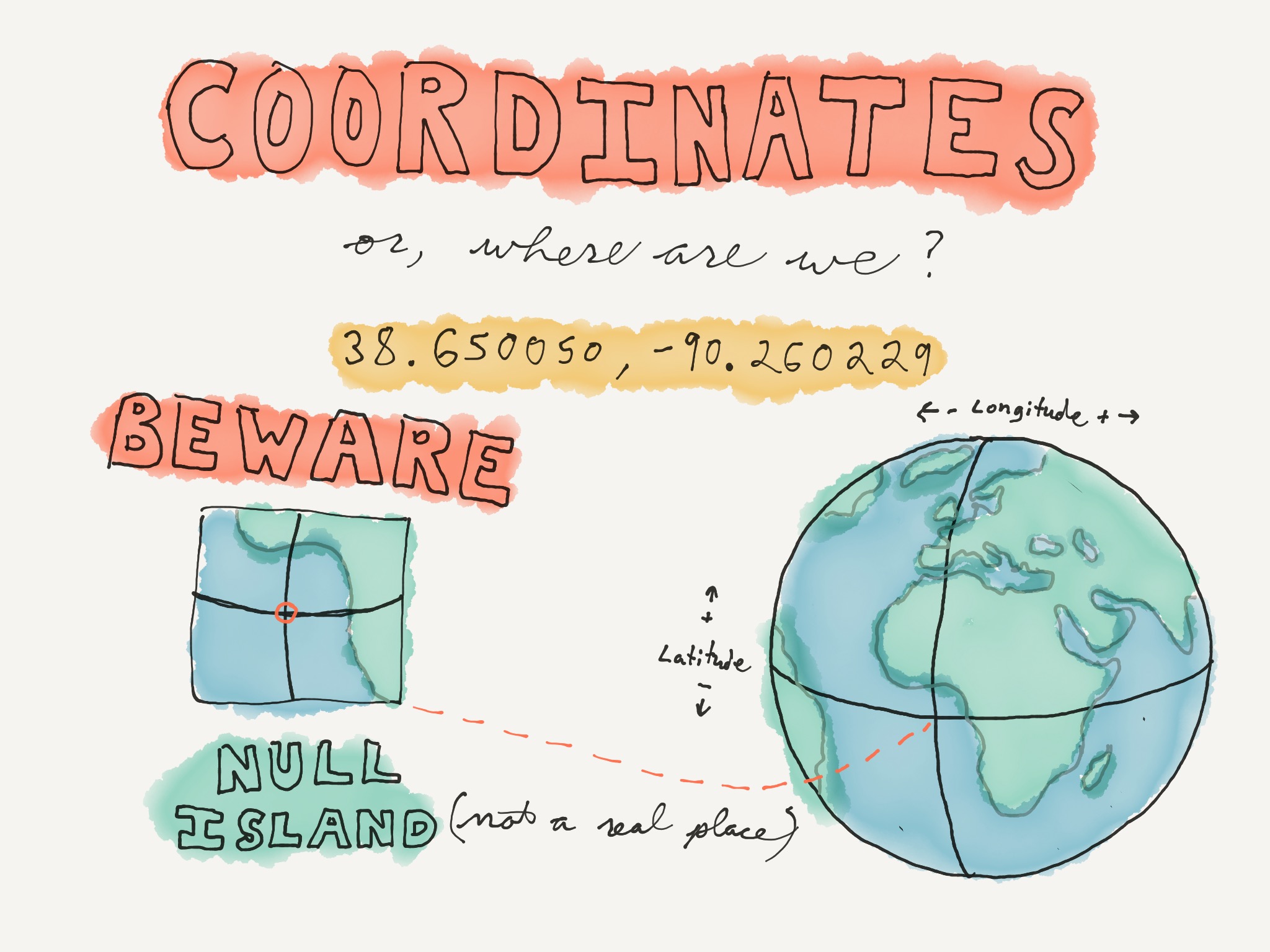
Next we have coordinates. This is latitude and longitude, expressed in decimal numbers. This one is where we are right now.
There are lots of services out there you can plug addresses into and get coordinates — this is known as geocoding. When you type an address into Google Maps and it puts a marker on a map for you, that's geocoding.
When you're using a service to do this, you need to be aware of Null Island. This is a fictional place, off the southwestern coast of Africa, where the Equator and the Prime Meridian cross. Its coordinates are 0,0. Anybody want to guess why you might end up there?
These services aren't perfect, and they sometimes can't parse an address, sending you to Null Island instead.
Another interesting thing is that each decimal place in the coordinates corresponds to a certain distance. That is, if you, for example, adjust any given number in the latitude up by one, you can figure out how much further north that will shift the coordinate.
The trick is to remember 111. The ones digit is worth about 111 kilometers. The tenths digit is 11.1, the hundredths is about 1.1, third digit is about 110 meters, fourth is about 11 meters, the fifth is about 1.1 meter and the sixth is about 11 centimeters.
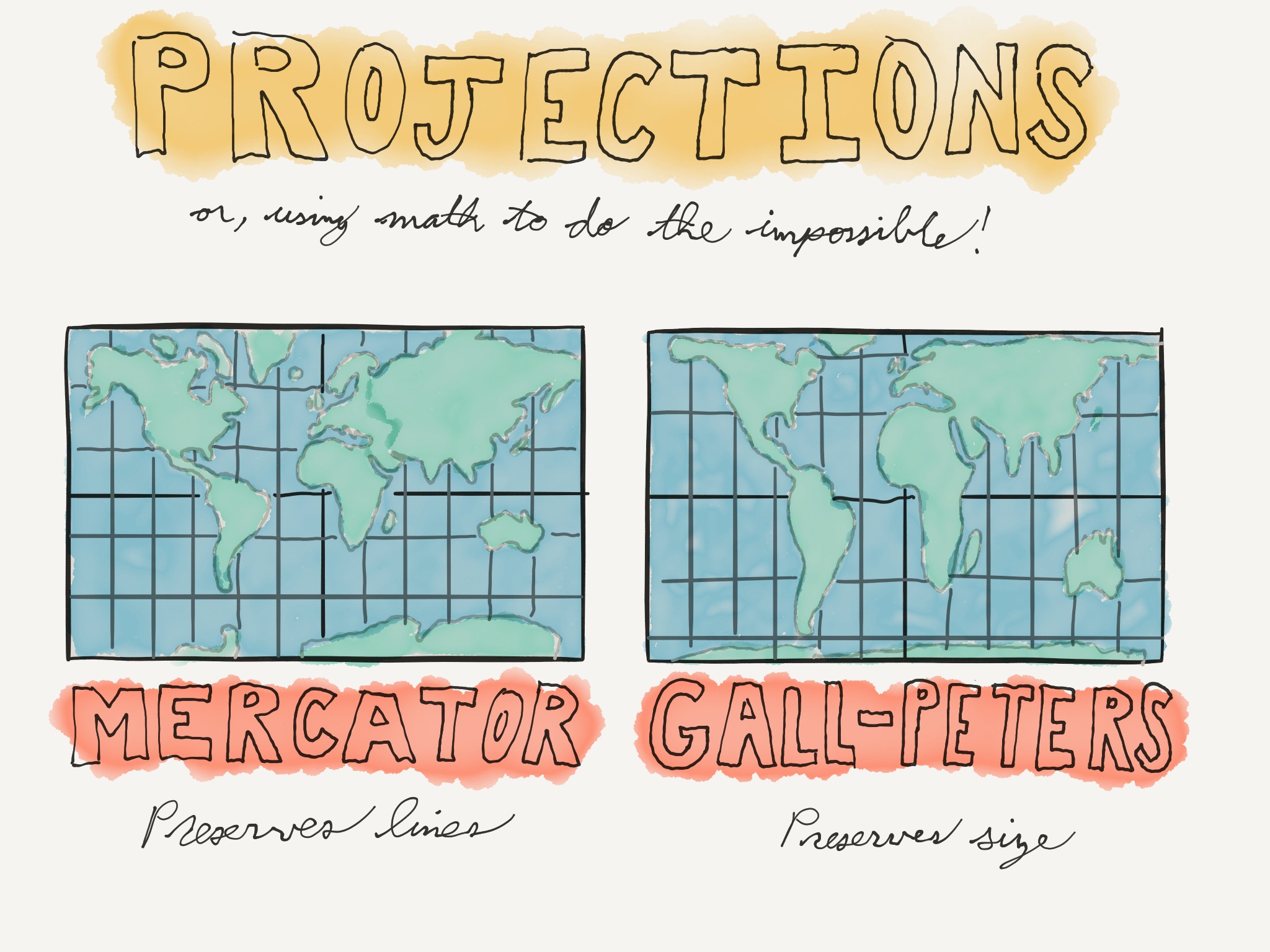
Next we have projections. There's a West Wing episode featuring this one.
Projections are a result of the fact that you can't take a spherical surface and project it onto a flat one without some distortion. So, we have to make some compromises.
If you're around my age you probably grew up with the map projection on the left. It's called the Mercator projection and it's been around since the 16th century.
On the other hand, the projection on the right is called the Gall-Peters projection, first described in the 1880s and popularized a century later.
Why would you use one over the other? Well, as you have to make some compromises and have some distortion in any projection, it all depends on what you plan on using it for.
The Mercator projection is used for navigation. It preserves what are called lines of constant bearing. But its downside is that it doesn't preserve relative size — areas closer to the polls are much larger than they should be, relative to areas near the equator.
The Gall-Peters projection distorts shape in order to preserve relative size. All the areas on this map are sized correctly relative to each other, but you wouldn't want to use it for sailing.
Why do you need to know all this? If you get into mapping, you'll likely want to use shapefiles that someone else produced, and you'll need to know what projection they're using. You also may need to decide which projection to use for your own projects.
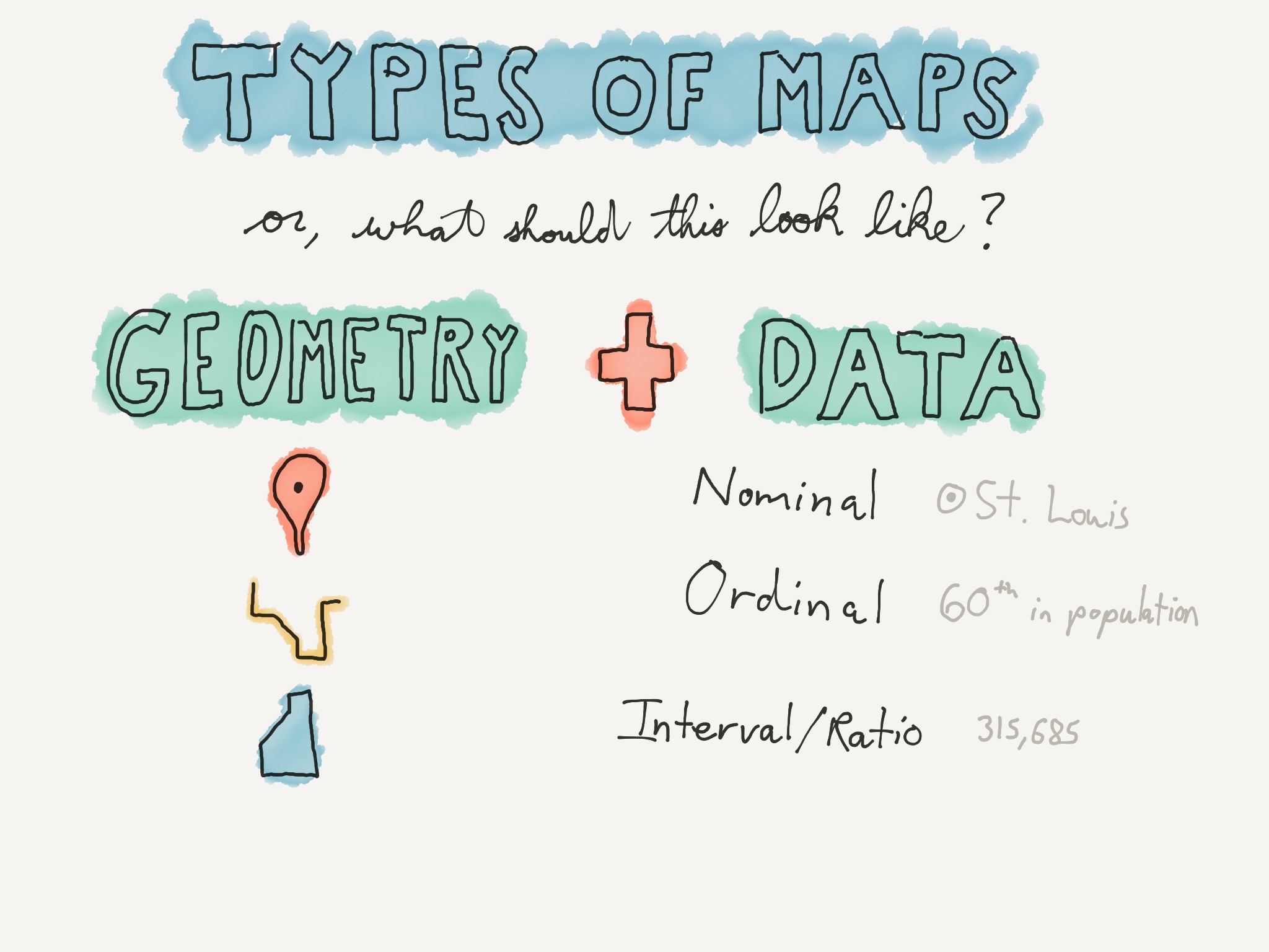
We're almost ready to make our map, but first we have to figure out what kind it is. In order to do that, you'll need to think about the type of shapes you have and the type of data you have.
Remember the shapes? Point, line, polygon.
There are also different types of data. The types of data I have here are nominal, ordinal and interval or ratio.
Nominal data is just a list of names — all the cities in Missouri, all the states, all the school districts.
Ordinal data adds some kind of ranking. We don't care about the actual data, but we're classifying, so things like capital city or not, or surface street versus two-lane highway versus four-lane highway.
And finally interval or ratio data is what you'd commonly think of as data, like population in a county or graduation rate of a school.
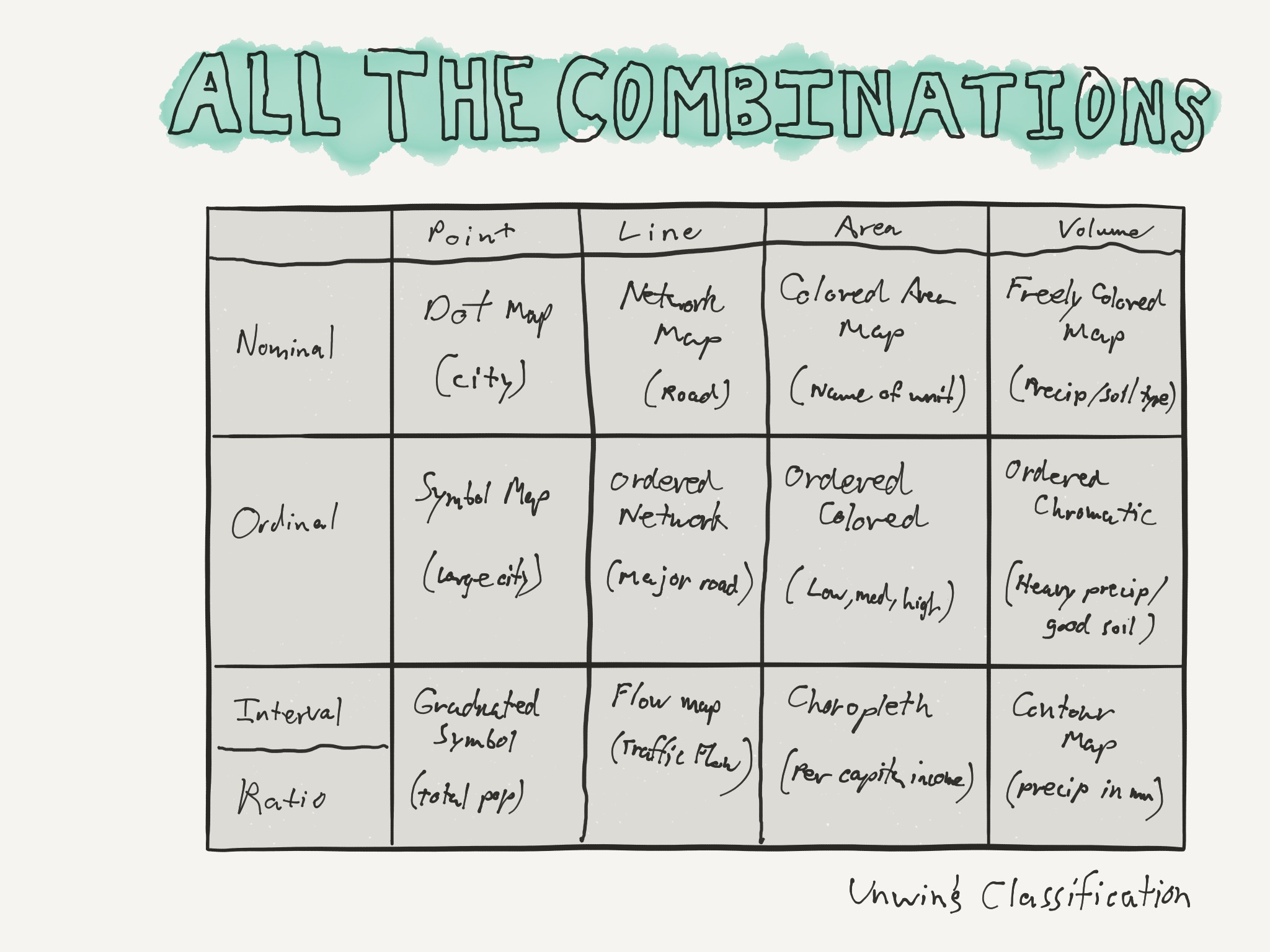
And you can add those up in all different combinations and get different kinds of maps. I found this online, in a similar presentation, and they called it "Unwin's Classification". I'm not going through all these, but the point is that the type of map you make is going to be fundamentally dictated by the shapes you're using and the kind of data.
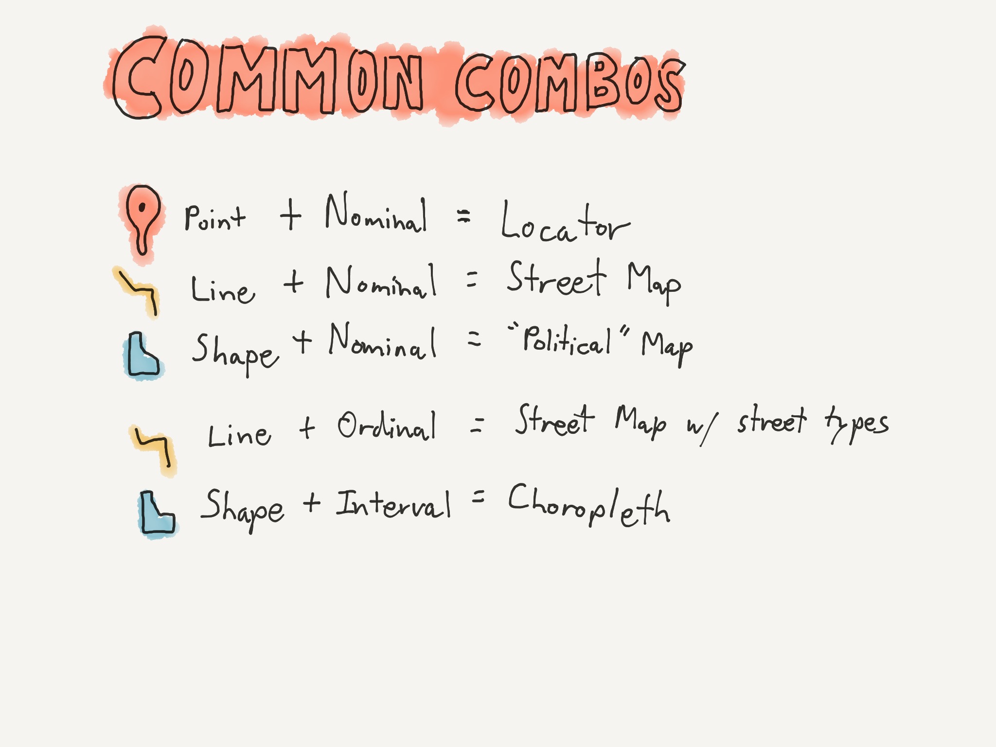
Here are a few common ones:
- Point data + names = locator map.
- Line data and nominal data = street map.
- Polygon data and names, think of your big pull-down classroom four-color state map.
- Lines plus ordinal data is a street map with different street types designated somehow. Like an atlas where you can tell highways from gravel roads.
- And polygons plus interval or ratio data are one of the most common map types, the choropleth.
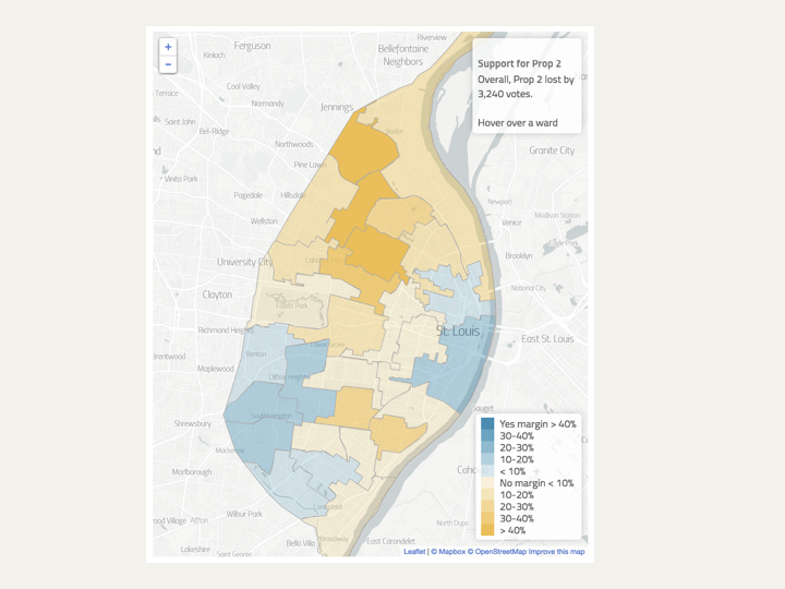
Here's an example of a choropleth map. We'll come back to this in just a second.
Because I'm going to use one of these — this one, in fact — for my example, I should also point out one more feature that's often overlooked. And that's data classification.
See the legend at the bottom there? How did those different buckets come about, and are there other ways of choosing them?
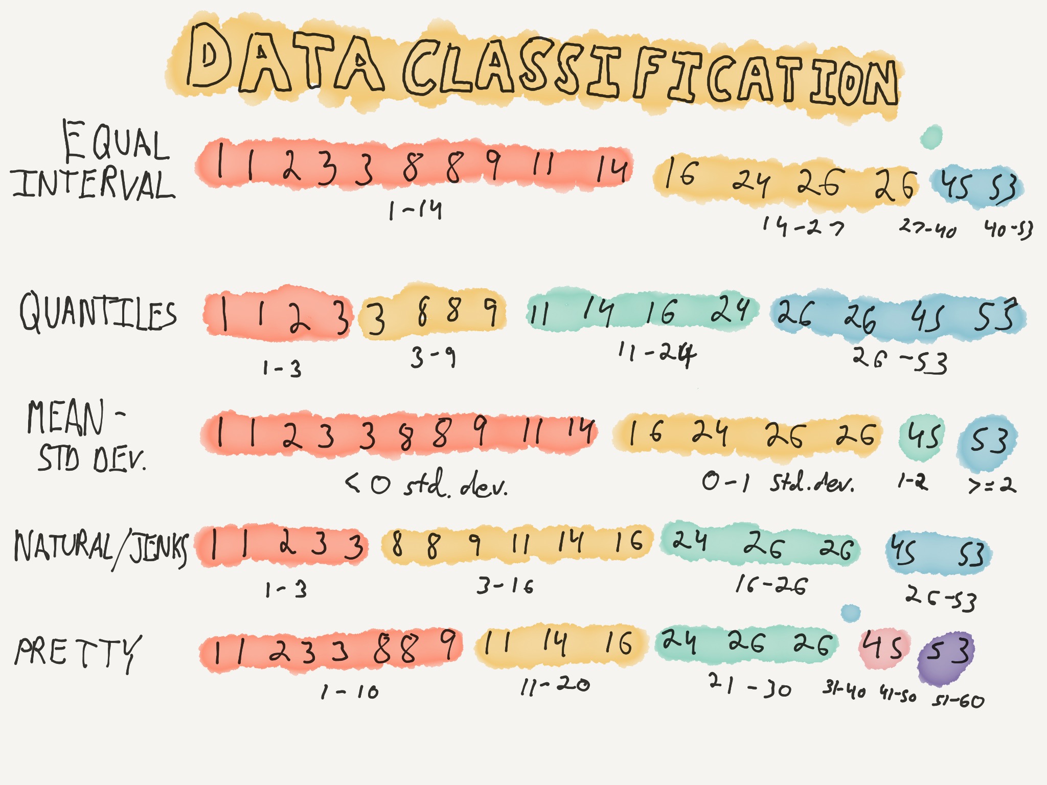
Turns out, there are. And they're pretty important.
I'm going to speed through five of them pretty quickly here. These are all ways of taking the same dataset and grouping them differently in order to show different things or provide different kinds of analysis.
You can see the dataset we're working with here. Starts at one and goes up to 53. There are 16 data points. Some duplicates in there. I found this dataset online as well, used to illustrate our first two methods, equal interval and quantile.
In equal interval, you figure out how many different "buckets" you want, represented here by colors, and then you figure out the range of data for each bucket, so that each one has an equal range. In this case we want 4 buckets and our range is 53, so our buckets need to accommodate 13 numbers each after rounding. You might also notice in this case that our third bucket doesn't have any data points in it. So on a map, you'd have that shown in the legend, but that color wouldn't actually appear anywhere on the map.
Quantiles are much easier. You just figure out how many buckets you want, and divide the number of data points by that to figure out how many go in each bucket So in this case, 16 divided by 4 is 4 points per bucket. You lay them all out in order, and divide in the appropriate place. One weird thing here is that you have the two threes in different buckets. Some mapping programs fudge this and put equal data points in the same bucket no matter what. Another thing to note with this one is that the red bucket's data's range, the difference between the biggest and smallest point, is just three, while the blue bucket's range is 27.
Up next there's Mean-Standard Deviation. This puts things in buckets based on how far away they are from the average value.
Natural Breaks, or Jenks Breaks does some fancy math that I don't really understand, but the idea here is that it finds breakpoints that minimize variation within each group, but maximize variation between groups.
And finally, the one we use most often in news I think, Pretty Breaks. This one is like Equal Interval, in that each group represents the same range size, but instead of using the data to determine the range size, we pick an arbitrary round number, in this case 10. One thing to notice about this is that I've had to add two new buckets, and we also wind up with one unused.
But are these really that important? Does it matter which one you pick?
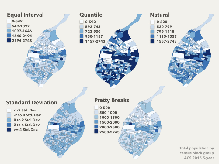
You bet it does. This is the same data set — population by census block group — mapped with the same color scale, but using the five data classification systems that we just talked about. They look pretty different, right?
Using some software, you can switch between each of these to see what insights they give you. Quartiles might be useful if, for example, there's a program or policy targeting the top 20% or bottom 20%. Standard Deviation again shows you how far away from average things are, so you can see that there aren't a lot of block groups that are outliers — most of them are within a couple standard deviations of average. And again you can see I've had to add another bucket for pretty breaks.
One word on Natural Breaks — these often give you the great insight into patterns, but because they're calculated based on relationships in the data itself, you shouldn't compare two maps created with that classification system — the buckets and the relationships between the buckets won't represent the same thing.
The rest of the presentation was looking at some of my terrible code that runs a leaflet.js map. Fortunately, you're on the internet and there are many better tutorials available. Here are some.
More resources:
- Google Fusion Tables — easily create a map with data
- Let's make a map — classic mapping tutorial using d3.js
- St. Louis County's Open Data site — Local data and shapefiles
- St. Louis' Geospatial Research site — Info and shapefiles from the city